SPACES
Strategic Property Advancement: Climb, Explore, Succeed
Spaces is a responsive web app designed to equip aspiring investors with the essential tools and resources they need to confidently venture into the property market. Featuring an intuitive interface and tailored insights, Spaces empowers users with data-driven guidance, expert advice, and personalized recommendations to help them make informed investment decisions and maximize their returns. By streamlining the complex process of property acquisition and offering targeted support for investment strategies, Spaces aims to revolutionize the way individuals approach real estate investing and facilitate a seamless, rewarding experience every step of the way.
ROLE & TASKS
UI Designer - I designed the app brand and created a user-friendly interface based on a provided brief.
PROJECT LENGTH
8 Weeks
TOOLS
Pen and paper, Figma, Illustrator, Photoshop
PROJECT BRIEF
This web app targets new and small-scale property buyers seeking additional income or financial security through investments. It provides uncomplicated and reliable information on potential property investments. Buyers can access the tool from anywhere, whether at home or on-the-go.
The user persona was provided in the project brief.
MoodBoard 1
MoodBoard 2
After developing two distinct moodboards, I ultimately chose to move forward with moodboard 2 for the design direction.
This choice was influenced by the project brief, which emphasizes SPACES as a web app that simplifies the process of investing in properties for financial growth, rather than assisting users in finding a place to call home.
Moodboard 2, featuring vibrant colors and a sans-serif font, conveys a clean, energetic, and user-friendly environment where individuals can swiftly locate and assess the right investment properties. This design direction aligns well with the app's primary goal of facilitating property investment decisions.
In contrast, moodboard 1 centers around pastel, warm tones that create an atmosphere of comfort and family, reminiscent of a cozy home. While this aesthetic may be appealing, it does not align with the core purpose of the SPACES web app, which is to support users in their property investment journey.
By selecting moodboard 2, the design will better resonate with the target audience and their investment-oriented objectives.
User Flow
Based on the user needs, here are three user flow diagrams that outline: how to create a profile, search and filter properties, and how to contact an agent.
Low-Fidelity Wireframes
In the initial stage of the design process, I developed a first iteration of low-fidelity wireframes to establish the basic layout and structure.
Mid-Fidelity Wireframes
I developed the mid-fidelity wireframes to show more visual details on the layout before adding any styling.
High Fidelity Wireframes
In the final stage, I developed high-fidelity wireframes that incorporated color, styling, and UI elements, guided by the chosen moodboard and three essential keywords: EASY, RELIABLE, and EXCITING.
These keywords guided the design process, ensuring that the app's interface remained user-friendly, trustworthy, and engaging. By focusing on these core principles, I aimed to create an intuitive and efficient user experience that would resonate with the target audience, ultimately making the process of property investment more approachable and enjoyable. The high-fidelity wireframes bring together the visual elements and interactive components in a cohesive manner, reflecting the app's commitment to simplifying property investment and delivering a standout user experience.
Screen Details
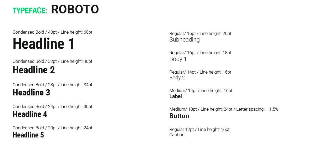
Style Guide
Different Break Point
While designing the web app, I paid close attention to various breakpoints to ensure a seamless and responsive user experience across different devices and screen sizes. By carefully considering these breakpoints, I was able to optimize the layout, UI elements, and overall design, adapting them to provide a consistent experience for users on smartphones, tablets, and desktop computers.
This responsive design approach ensures that the app caters to a diverse audience and delivers a high-quality user experience, no matter the device being used.
Click here to test the high fidelity prototype.
Key Learnings
I found working on this project, an engaging experience. Initially, I was inclined to use warm and earthy tones, associating the app with a welcoming home atmosphere. However, after carefully analyzing the project brief - which targets primarily new, small-scale property investors seeking additional income or financial security - I opted for blue and green. Blue symbolizes calmness, stability, and reliability, while green represents abundance, money, and luck.
What’s Next?
One area I'd like to improve upon is designing a unique set of icons for various property types and features (e.g., garden, parking, auction property, etc.), enhancing the app's visual appeal.
Moving forward, I would also like to implement two new features:
A 24/7 digital assistant to provide users with comprehensive support and guidance in finding the content they need or answering any questions they may have.
A function enabling multiple buyers to co-invest in a property by purchasing a percentage each, making it easier for new investors to enter the market.


